

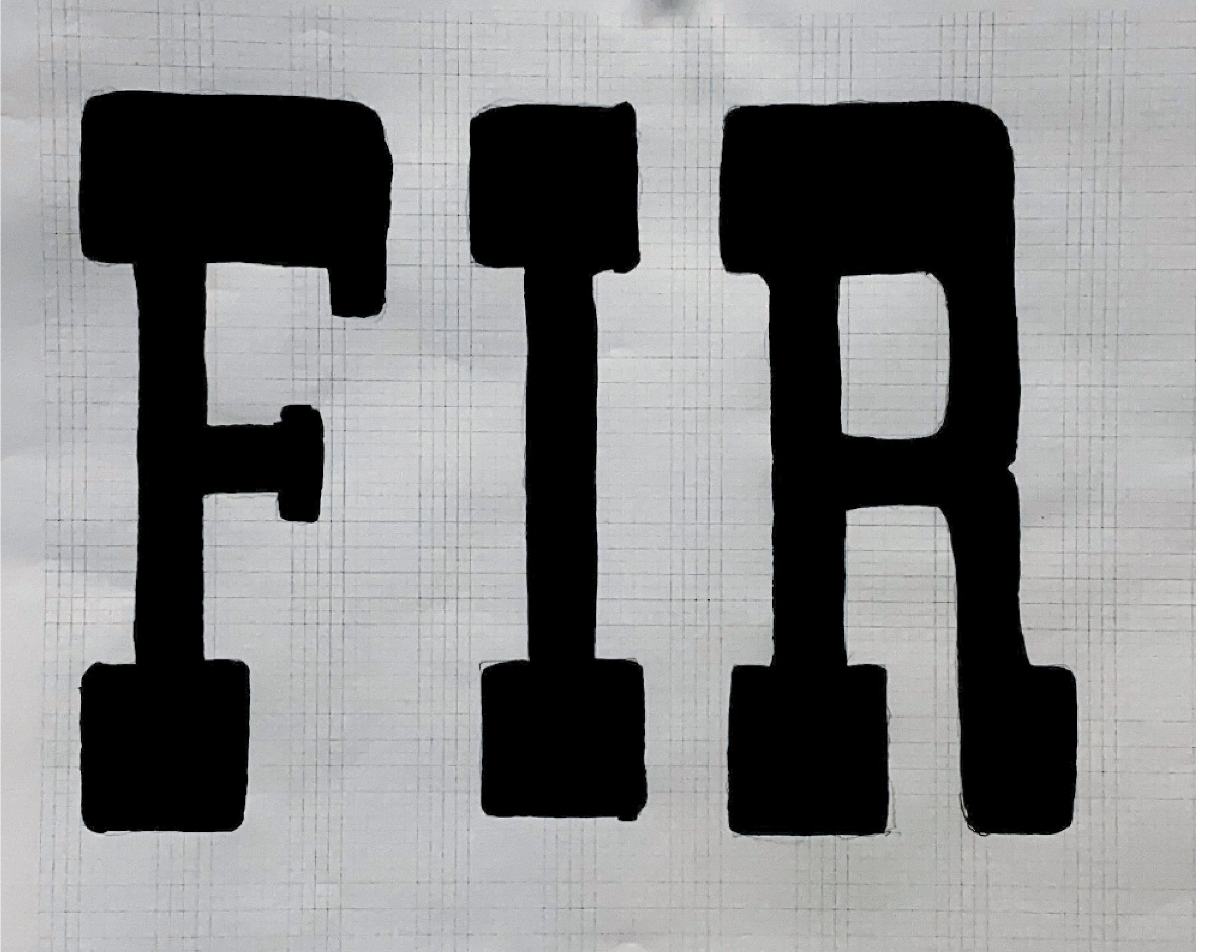
Vintage Type:
In this assignment, I was given the “R” style pictured on the left, along with the alphabet range E-I to come up with a cohesive three-letter group. I created a typeface through bit mapping, which kept the letter parts evenly spaced and the strokes from warping. With the style constraints of the original “R,” I created other letters that follow the same ‘style rules’ as the original typeface.
ASSIGNED LETTER GROUP: E-I

Assigned “R”
PROCESS
Bitmap Hand-Drawn Letters


First Round Illustrator Letter


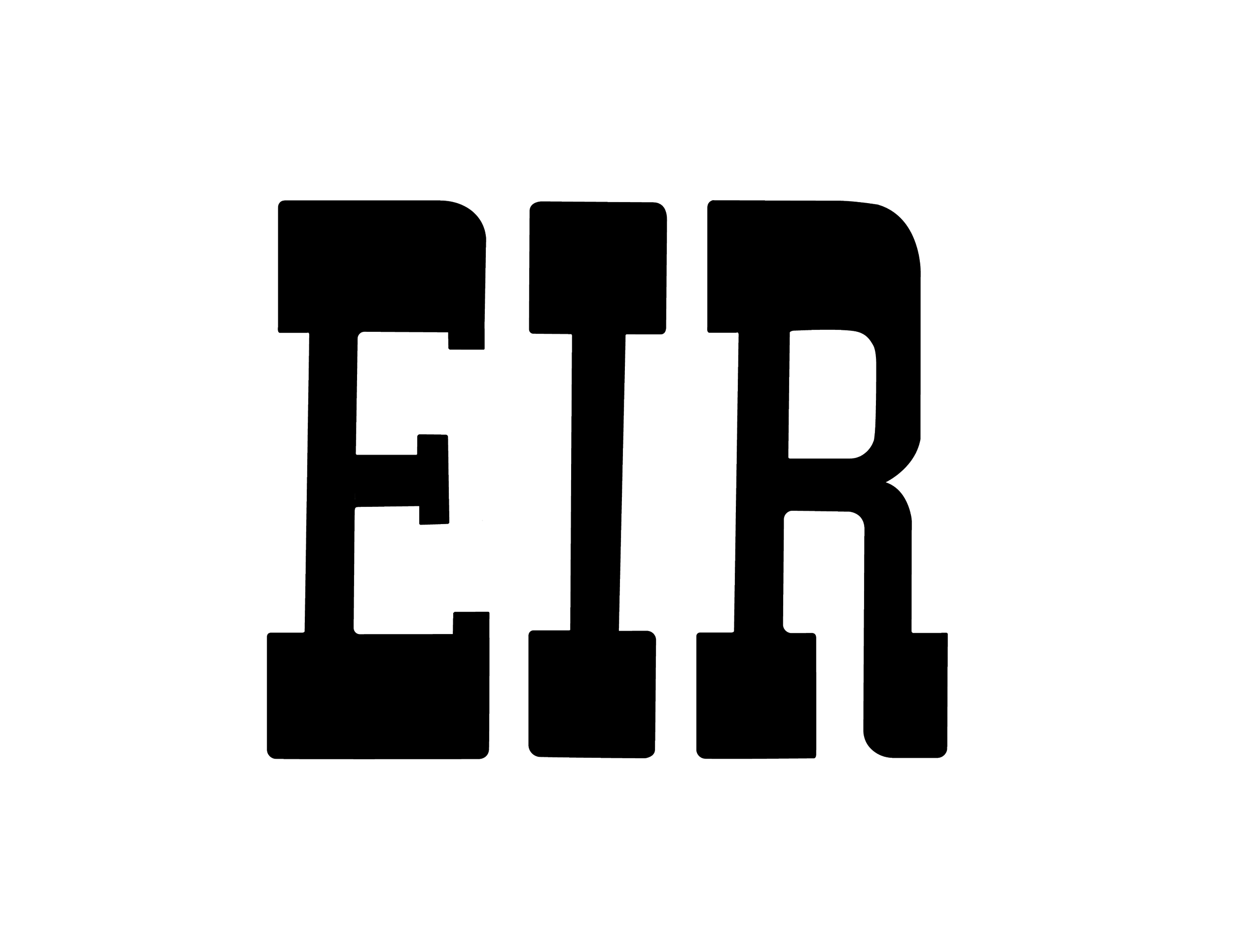

UPDATES
In the spring, I was able to review my work from GDSN 223 and make some adjustments to the letterforms. The biggest adjustments were in the rounded corners and ensuring the horizontal parts followed the same line all the way through each letter.

