Magazine spread reboot
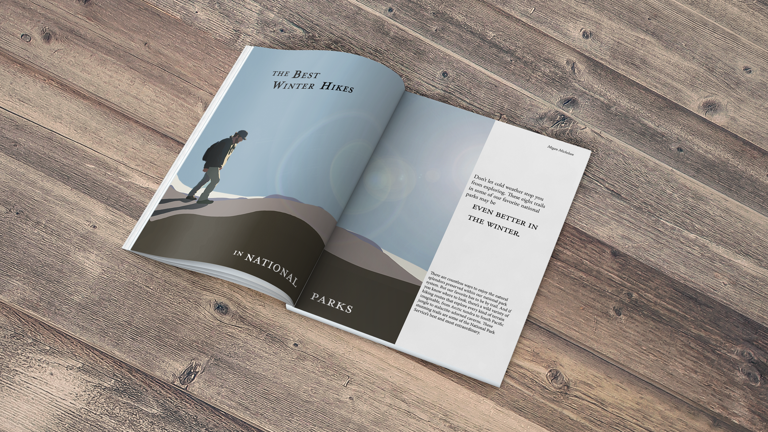
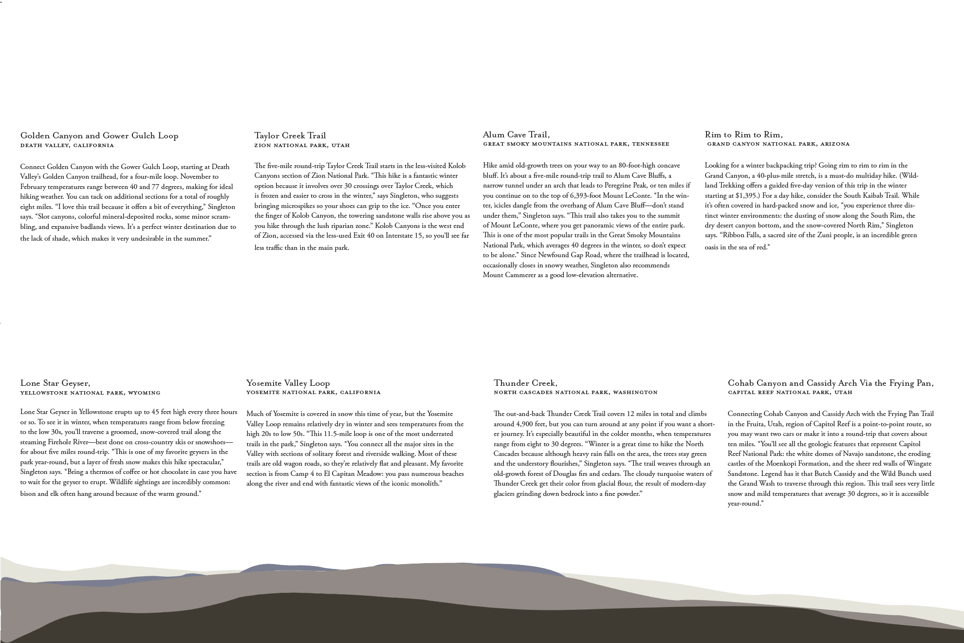
When reviewing the magazine articles that we brought into class I was most attracted to the articles that weren’t extremely text-heavy, and those that had a large image jumping the gutter on the cover page. I applied this to my spreads by having a large vector image cover page and a lot of space between information on the second spread. Because my cover page had a main focus on the vector image I created, I chose to make the typography more subtle. The focal point of the image is on the left side of the first page, balanced with the opening text on the right. The image jumps the gutter, which creates a continuous spread instead of two completely separate pages. I used the same typefaces throughout both spreads, one being titles, and the other for paragraph text.


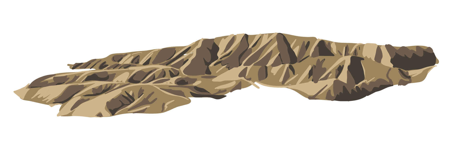
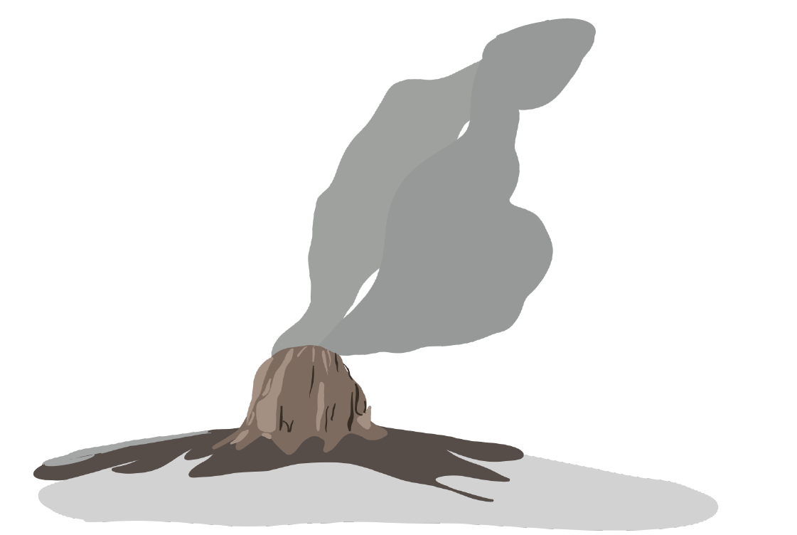
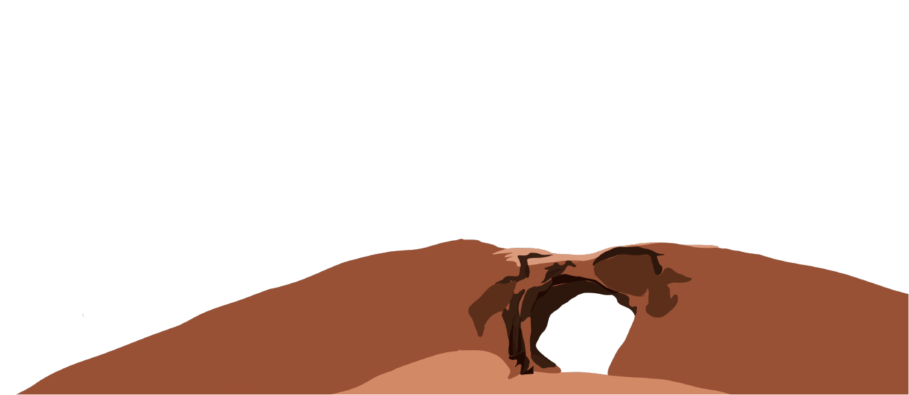
Process Work